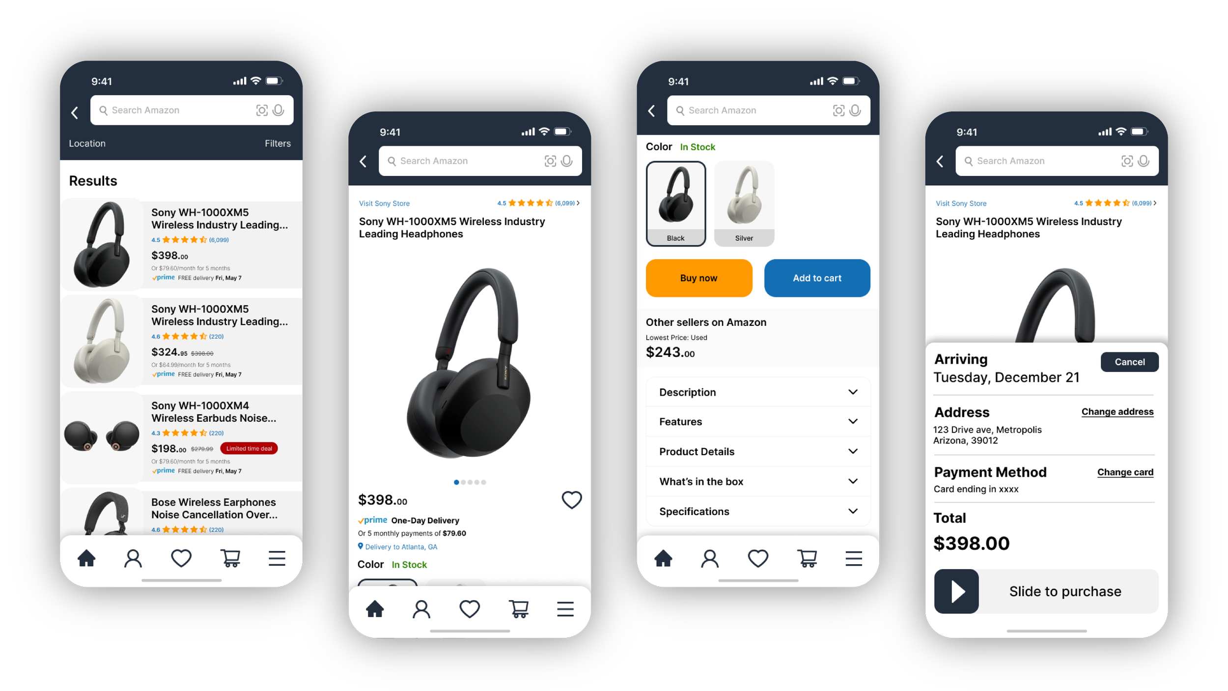
Amazon App Redesign
I was given the freedom to select any application or website for redesign. I chose to redesign the Amazon app because there have been few changes in recent years, leaving it outdated in certain areas. This is an application that millions of users use daily, and Amazon excels in providing users with all the necessary functions.
Problem
After conducting research and interviewing users, the primary issues with the Amazon app were that product pages contained excessive information, leading to excessive scrolling. While this information was beneficial, its organization was poorly structured according to user preferences. Consequently, key product information was difficult to locate due to its placement at the bottom of the page.
Solution
Based on the research findings, I revamped the user interface of the Amazon application, preserving its existing functionalities while enhancing its product page structure. My primary objective was to minimize scrolling while ensuring the efficient presentation of all pertinent information.


The Accordion
To address the issue of endless scrolling and the concealment of crucial product information at the bottom, I implemented an accordion mechanism that maintains all information at the top without occupying excessive space. This expandable feature ensures that the information remains readily accessible whenever required.
Before
Product Info
After
Product Info


